Power BI for Manufacturing: Complete Guide to OEE, Dashboards & Real-Time Analytics
Master production analytics with proven Power BI strategies for OEE, downtime analysis, quality metrics, and Industry 4.0 dashboards—built for Fortune 500 manufacturers.
Learn how to integrate MES, ERP, and historian data into unified Power BI dashboards. Implement governance-first analytics for operations, quality, maintenance, and supply chain teams.
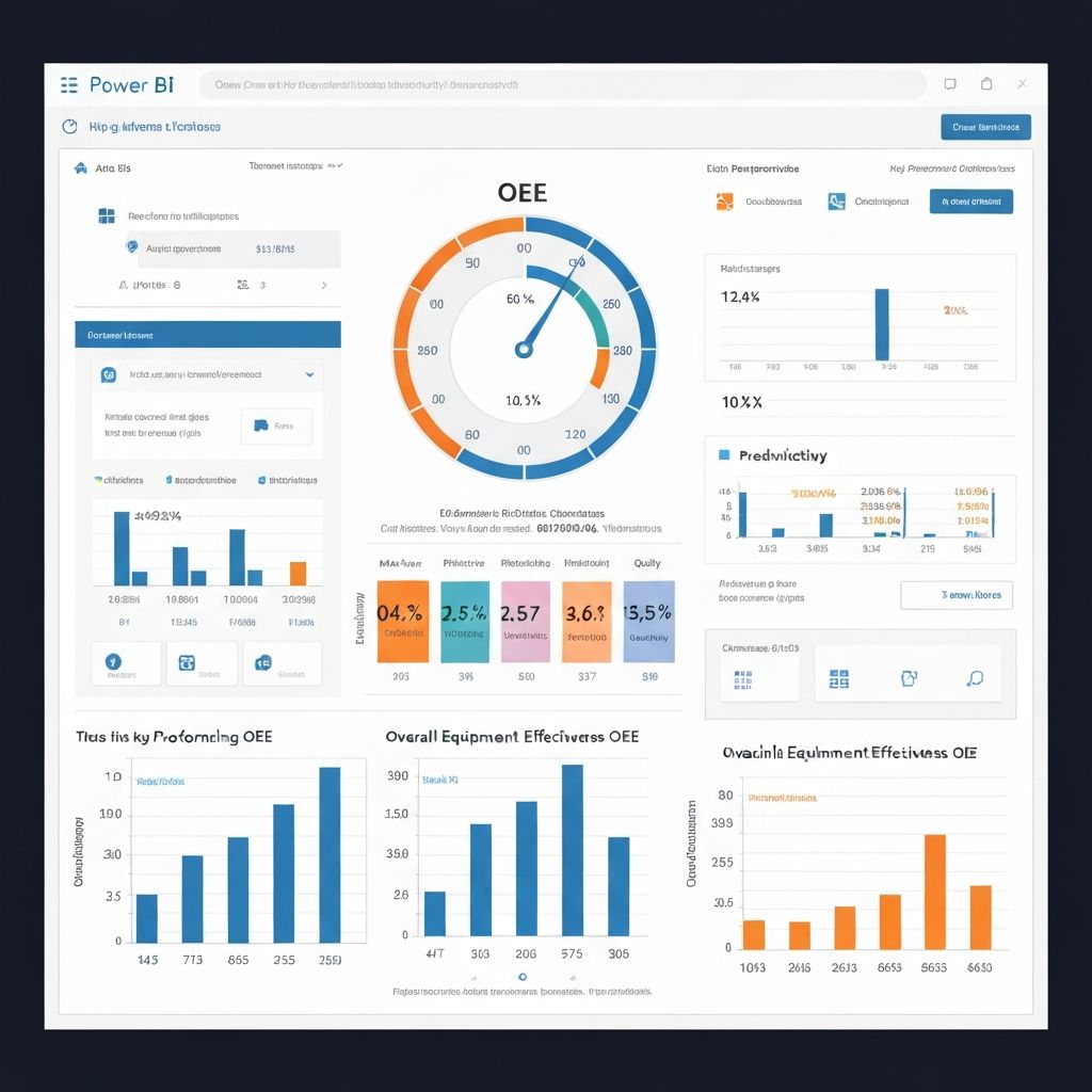
Table of Contents
Introduction: Why Manufacturers Need Real-Time Analytics
Modern manufacturing is under pressure. Supply chains are volatile. Customers demand faster turnaround. Regulatory requirements are tightening. And every minute of unplanned downtime costs thousands of dollars.
Yet many manufacturers still rely on spreadsheets, manual reports, and siloed data systems. Plant managers don't see real-time OEE. Quality teams can't trace defects to root causes quickly. Maintenance teams react instead of predict. The result? Missed opportunities, higher costs, and slower decisions.
Power BI for manufacturing changes this. By unifying data from your MES (Manufacturing Execution System), ERP, historians, and shop floor sensors, you gain real-time visibility into production performance, quality, and efficiency. Decisions move from days to minutes.
Key Benefits
- 2-5% OEE improvements through better visibility and quick problem-solving
- 5-15% reduction in unplanned downtime via predictive maintenance
- 3-10% scrap reduction through quality trend analysis and root cause tracking
- 40-60% faster decision-making with real-time dashboards
- Enterprise governance and compliance-ready architecture from day one
What is Power BI for Manufacturing?
Power BI is Microsoft's business intelligence platform that transforms raw data into visual insights and actionable dashboards. For manufacturers, it excels at:
Critical Manufacturing KPIs Explained
Successful Power BI implementations start with clarity on KPIs. These are the metrics that matter most to your operations, quality, and finance teams.
The industry standard for production efficiency. OEE combines availability, performance, and quality into one score (0-100%).
- Availability (%)
- Performance rate
- Quality yield
- Equipment utilization
Critical for predicting failures and planning maintenance. MTBF (Mean Time Between Failures) and MTTR (Mean Time To Repair) drive reliability.
- Unplanned downtime
- MTBF hours
- MTTR minutes
- Downtime by reason code
Measures production speed and bottlenecks. Track units/hour, cycle time, and takt time vs actual for capacity planning.
- Units/hour
- Cycle time (min)
- Takt time analysis
- Bottleneck identification
First-pass yield, defect rates, and scrap tracking. Root cause analysis and SPC (Statistical Process Control) for prevention.
- First-pass yield (%)
- Defect rate (ppm)
- Scrap % by line
- Quality trend
Inventory turns, WIP aging, and on-time-in-full (OTIF) delivery. Critical for reducing carrying costs and improving cash flow.
- Inventory turns
- WIP aging days
- OTIF %
- Stockout incidents
Planned vs unplanned maintenance ratio, preventive maintenance effectiveness, and spare parts utilization.
- Planned % of workload
- Maintenance cost/unit
- Asset health score
- Parts inventory turnover
OEE (Overall Equipment Effectiveness) Deep Dive
OEE is the gold standard for measuring production efficiency. If your manufacturing operation has one metric to track, it's OEE. Let's break down the formula and how to implement it in Power BI.
OEE Formula
OEE (%) = Availability (%) × Performance (%) × Quality (%)
Availability
The percentage of planned production time the equipment actually ran.
Availability = Run Time / Planned Production Time
Example: If planned production was 480 minutes but downtime consumed 60 minutes, availability = 420 / 480 = 87.5%
Performance
The speed at which the equipment ran versus its theoretical maximum.
Performance = Actual Output / (Theoretical Max Output × Run Time)
Example: If theoretical max is 100 units/min, run time is 420 min, but actual output is 38,000 units, performance = 38,000 / (100 × 420) = 90.5%
Quality
The percentage of units that meet quality standards.
Quality = Good Units / Total Units Produced
Example: If 38,000 units were produced and 750 were defective, quality = 37,250 / 38,000 = 98%
Final OEE Calculation: 87.5% × 90.5% × 98% = 77.4%
Industry benchmark: 85%+ is world-class. 65-75% is typical for most manufacturers. Below 50% signals major efficiency issues.
Implementing OEE in Power BI: Step-by-Step
Collect from MES/ERP: planned production time, downtime events (with reason codes and timestamps), actual output counts, and quality/defect data.
Create fact tables (downtime, production, quality) and dimensions (date, equipment, shift, reason). Use star schema for performance.
Create measures for Availability, Performance, Quality, and OEE. Use time intelligence for trend comparisons (day-over-day, month-over-month).
Layer by hierarchy: company → plant → line → shift. Add drill-throughs to root cause analysis for each deviation.
Pro Tip: Always segment OEE by equipment, shift, and operator. A single OEE number hides problems. Drill-down is critical for diagnostics.
Production Dashboards: From Theory to Practice
A well-designed manufacturing dashboard tells a story. It answers the most pressing question at a glance: "Are we on track?" Then it enables deeper investigation.
Dashboard Hierarchy
Audience: Plant Manager, Director of Operations
Key Metrics: Plant OEE, Total Downtime (hours), On-Time-In-Full %, Quality Score, Safety Incidents (LTI)
Update Frequency: Daily
Layout: KPI cards showing current vs target, trend sparklines, visual status (red / yellow / green), with drill-to-details.
Audience: Production Supervisor, Line Lead
Key Metrics: OEE by line, Real-time production (units/hour), Cycle time vs takt, Active downtime (reason, duration), Queue analysis
Update Frequency: Real-time (refresh every 5-15 min)
Layout: Gauges for each line, waterfall charts for downtime, queue heatmaps, alerts for exceptions.
Audience: Quality Manager, Compliance Officer
Key Metrics: First-pass yield, Scrap rate, Defect trends (by type & cause), Non-conformances (NCRs), Test results pass rate
Update Frequency: Daily / Real-time for critical lines
Layout: SPC charts, Pareto charts (defects by type), Trend analysis, Lot traceability drill-down.
Audience: Maintenance Manager, Reliability Engineer
Key Metrics: MTBF, MTTR, Planned vs unplanned maintenance ratio, Spare parts inventory, Equipment health score
Update Frequency: Daily
Layout: Equipment health matrix, Maintenance schedule vs completion, Spares consumption forecast, Predictive maintenance alerts.
Dashboard Design Principles
- Signal-to-Noise Ratio: Show only metrics that drive action. Remove vanity metrics.
- Hierarchy Matters: Summary at the top, drill-down details on-demand.
- Real-Time When It Counts: Operations dashboards near-real-time (5-15 min refresh). Executive dashboards can be daily.
- Actionable Insights: Every visual should answer "what should I do about this?"
- Mobile-First Design: Supervisors and plant managers need smartphone access.
Data Integration: MES, ERP & Historians
Your manufacturing data lives in multiple systems. Power BI's role is to unify them into a single source of truth. Here's how to approach integration.
MES (Manufacturing Execution System)
Common MES platforms: Ignition (Inductive Automation), Rockwell MES, Siemens Wonderware, Apriso.
What to extract: Production orders, actual output counts, downtime events (with reason codes and timestamps), quality inspections, operator logs.
Integration method: REST API (if available) or direct database query via Power BI connectors (SQL Server, PostgreSQL, etc.). Schedule daily or near-real-time refresh.
ERP (Enterprise Resource Planning)
Common ERP systems: SAP, Dynamics 365, Oracle, NetSuite, Infor.
What to extract: Bill of materials (BOM), production schedules, cost data, inventory levels, customer orders, on-time-in-full tracking.
Integration method: Use native ERP connectors (e.g., Dynamics 365 connector) or OData feeds. Daily refresh is typical.
Historians (Time-Series Data)
Common historians: OSIsoft PI, InfluxDB, Graphite, Prometheus.
What to extract: Machine parameters (temperature, pressure, vibration), sensor data, energy consumption, real-time KPIs.
Integration method: REST API to pull aggregated time-series data. For high-volume streaming, consider an intermediate data lake (Azure Data Lake, S3) or data warehouse (Snowflake, BigQuery).
Quality Management Systems (QMS)
Common QMS: Dude Solutions, Maximo, SAP QM, MasterControl.
What to extract: Inspection results, defect codes, non-conformances (NCRs), corrective actions (CAPAs).
Integration method: API or database export. Daily refresh suffices.
Integration Architecture Best Practice
MES → Data Lake/Warehouse ← ERP
↓
Power BI Semantic Model
↓
Dashboards & Reports
Why this approach?
- Centralized transformation: Clean data once, use everywhere.
- Better performance: Power BI connects to an optimized schema, not raw transactional systems.
- Consistency: Single definition of metrics across tools.
- Scalability: Easier to add new data sources later.
Data Quality Check: Before building dashboards, validate that your MES timestamps, production counts, and quality flags match reality. Garbage in = garbage out.
Security & Governance for Manufacturing
Manufacturing data is sensitive. Production schedules, cost data, quality issues, and equipment parameters must be protected. Power BI's governance features ensure security without sacrificing speed.
Restrict dashboard data by plant, line, or department based on user identity.
Example:
- Plant A Manager sees only Plant A data
- Quality Lead sees all plants but only quality metrics
- Executive sees all data, all plants
Hide sensitive columns (cost, margin, supplier pricing) from specific user groups.
Example:
- Operators see production & quality, not cost
- Finance sees margins, operations sees throughput
Track data sources and transformations. Log user access for compliance.
Enables:
- Root cause analysis ("where did this number come from?")
- SOX, FDA, ISO compliance audits
- Data governance documentation
Embed dashboards in manufacturing apps with service principal + RLS.
Use case:
- Mobile app for supervisors (only their lines visible)
- Plant floor kiosk (live OEE, anonymized shift data)
Implementation Roadmap
A successful manufacturing analytics deployment follows a proven phased approach. Rushing causes data quality issues and low adoption.
Phase 1: Discovery & Planning (2-3 weeks)
- Identify key stakeholders (ops, quality, maintenance, finance)
- Document KPIs and success metrics
- Map data sources and assess quality
- Design semantic model architecture
- Estimate timeline and budget
Phase 2: POC - Proof of Concept (3-4 weeks)
- Build dashboards for one production line or department
- Validate data accuracy against manual records
- Gather user feedback and refine designs
- Demonstrate ROI and business impact
- Build internal champion network
Phase 3: Rollout (6-8 weeks)
- Expand to all lines/departments
- Implement governance (RLS, audit, documentation)
- Deploy embedded apps if needed
- Conduct training for all user groups
- Establish refresh schedules and SLAs
Phase 4: Optimization & Scaling (Ongoing)
- Monitor dashboard performance and adopt feedback
- Optimize DAX and data refresh
- Add advanced analytics (predictive, AI)
- Expand to supply chain, finance, HR
- Plan for advanced use cases (ML, automation)
Success Factors
- Executive sponsorship: Plant Manager or VP of Operations must champion the project.
- Data quality first: Invest time to clean and standardize data early.
- Quick wins: Deliver value in weeks, not months. Build momentum.
- User training: Dashboards are useless if people don't know how to read them.
- Continuous support: Have a dedicated support person or vendor on retainer.
Industry Case Studies & ROI
Real-world examples of how manufacturers have transformed operations with Power BI.
Challenge
Multiple bottling lines running in silos. No real-time OEE visibility. Quality issues took days to trace.
Solution
Built unified OEE dashboard connecting MES and quality data. Enabled line supervisors to see bottlenecks in real-time.
Results
- OEE improved 4.2% in 3 months
- Downtime reduced by 12%
- Quality defects down 8%
- Adoption rate: 95% of supervisors using daily
Challenge
Supply chain visibility fragmented. Late deliveries impacting customer satisfaction. Inventory costs rising.
Solution
Built supply chain control tower integrating ERP, MES, and logistics data. Added predictive alerts for inventory stockouts.
Results
- On-time-in-full (OTIF) improved 18%
- Inventory carrying costs down 22%
- Decision latency reduced from 1 day to 2 hours
- Customer satisfaction +15%
Challenge
Highly regulated. Needed compliance-ready quality tracking. Manual reports consumed 40 hours/week.
Solution
Deployed Power BI with RLS, audit logs, and automated compliance dashboards. Embedded QMS data with SPC charts.
Results
- Audit preparation time cut by 60%
- Defect traceability improved to < 5 min
- First-pass yield up 3%
- No audit findings related to data quality
Best Practices for Maximum Adoption
The most advanced Power BI dashboard is worthless if people don't use it. Here's how to ensure adoption:
Adoption Metrics to Track
- Monthly Active Users (target: 80%+ of intended audience within 3 months)
- Dashboard views per user per week (target: 2-5 depending on role)
- Time spent per session (target: 10-20 min for operations, 5-10 min for execs)
- NPS score on dashboards (target: >50)
- Support tickets resolved via dashboards vs escalations (track trending improvements)
Frequently Asked Questions
Frequently Asked Questions
Share This Article
Ready to Transform Your Manufacturing Analytics?
Get a custom roadmap from certified Power BI experts. See how leading manufacturers achieve 2-5% OEE improvements and 40% faster decisions.